
 Late last month Google announced some major changes coming to mobile search that will affect a large number of websites. Starting April 21, the Google algorithm will include mobile-friendliness as a ranking signal. This means that, for searches done on mobile devices, websites that are optimized for those devices will be given a bit of a boost over websites that are not. (Websites that have been optimized for mobile devices are often referred to as mobile-friendly, responsive, or adaptive.)
Google is adapting to the way we access the Internet. And since mobile devices are gaining in popularity, Google feels it is important to provide users with a mobile experience that is more user-friendly. That, in turn, means businesses must also adapt. If your website isn’t optimized for smartphones, iPads, tablets, and other mobile devices your mobile traffic will most likely decline in the very near future.
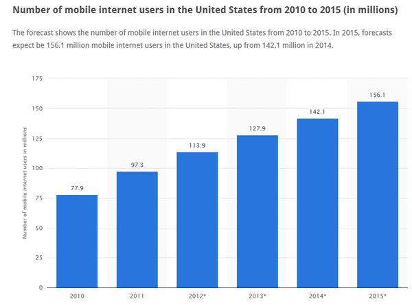
Even if you aren’t one of the millions of people using a smartphone, tablet, or other mobile device to access the Internet, it’s important to recognize the fact that mobile usage is most definitely on the rise. It’s estimated that 57% of internet users won’t recommend companies with poor mobile websites. And, according to Statista, “Currently, more than 100 million users in the United States access the internet via tablet or smartphone. Furthermore, the number of mobile-only internet users worldwide is expected to close in on half a billion users.” For a quick visual, take a look at the graph that shows that mobile internet usage has more than doubled in just five years.
So, what makes a website mobile-friendly?
According to Google, here’s the answer:
- Avoids software that is not common on mobile devices, like Flash
- Uses text that is readable without zooming
- Sizes content to the screen so users don’t have to scroll horizontally or zoom
- Places links far enough apart so that the correct one can be easily tapped
Google is already looking at websites and deciding whether or not they’re mobile-friendly. They’re even showing us in the results of searches that are done on mobile devices.

Is your website mobile-friendly?
- You may already know whether or not your website is responsive, but if not, you can find out with Google’s free mobile-friendly test.
- Visit the Webmasters Mobile Guide to learn how to make your website even better for smartphones and other mobile devices.
- If your website is verified in Google Webmaster tools, the Mobile usability report will tell you if there are any errors.
How can you make your website mobile-friendly?
If you find out that you don’t have a mobile-friendly website, you’ll want to change that as soon as possible and there are various ways to do it.
- Build your website using a Content Management System (CMS), like WordPress.
- Set up a second website specifically for mobile devices. Companies like Duda Mobile make it fairly easy to do this.
- Build what’s called an adaptive website, which uses a particular type of coding that allows the website to adapt to various devices.
What I use to build responsive websites
I’m a big fan of WordPress, which is a CMS. I use it to build all of my client websites as well as my own, including this one. A few other CMS software packages you may have heard of are Drupal, Joomla, and Blogger. There are many others as well. Using a CMS allows you to make your website responsive, which means you will build one website and it will ‘respond’ according to the device it’s being viewed on. The result will be an optimized website that fits all of the criteria mentioned above. (Besides being able to build a nice-looking responsive website, there are many other reasons why I like WordPress!)
WordPress, and other CMS packages, use what are called themes, and not all themes are responsive. So even if you already have a website built on WordPress, or another CMS, be sure to check it in the mobile-friendly test. If it turns out that your website is not mobile-friendly, it may be possible to add a plugin to make it so.
There’s no time to waste!
While Google has announced April 21 for the date they’ll start implementing the changes, they haven’t said how long it will take. But, why wait? If your website isn’t responsive, you’re going to be better off making the change as soon as possible.
Need help making your website mobile-friendly?
Do you need help getting your website mobile-friendly to make Google happy? If so, let me know. I can help by converting your website over to a responsive WordPress theme, or possibly helping you implement one of the other ways I talked about above.
Join the newsletter
Subscribe to get my latest content by email.
0 Comments